Render a long list with FlashList
This tutorial builds a feed of 200 items in 10 sections with FlashList. Each section starts with a header. Tapping a row selects it, and tapping it again unselects it. The code is one component, Feed, and a test file that checks each behavior, including what happens to a selected row when the list scrolls.
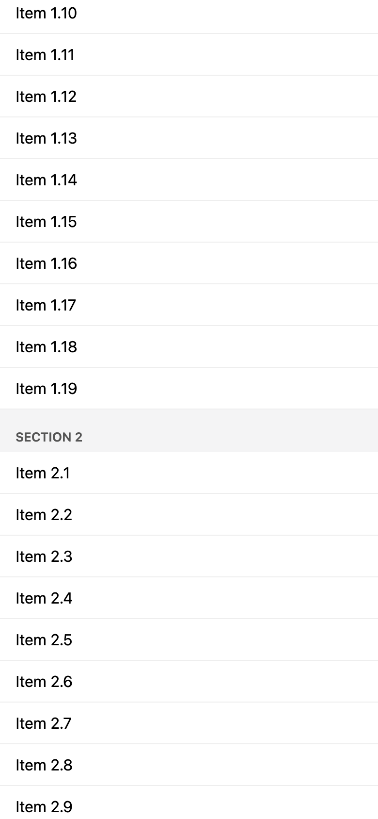
The example is an Expo project. Its own files are App.tsx, src/data.ts, src/Feed.tsx and __tests__/Feed.test.tsx. It uses FlashList 2.3.2, from the @shopify/flash-list package; for what changed in version 2, see FlashList v2 is a ground-up rewrite for the New Architecture.
The data
export type FeedItem = { id: string; title: string; kind: 'header' | 'row' };

// 200 items in 10 sections: every 20th item, starting with the first, is a
// section header, followed by its 19 rows.
export const feed: FeedItem[] = Array.from({ length: 200 }, (_, index): FeedItem => {
  const section = Math.floor(index / 20) + 1;
  const position = index % 20;
  return position === 0
    ? { id: `section-${section}`, title: `Section ${section}`, kind: 'header' }
    : { id: `item-${section}-${position}`, title: `Item ${section}.${position}`, kind: 'row' };
});
src/data.ts generates the 200 items. Every 20th item, starting with the first, is a header (kind: 'header'), followed by 19 rows (kind: 'row'). Each id comes from the item's place, so it is unique: section-2 is the second header, and item-2-3 the third row after it.
The list
import { FlashList } from '@shopify/flash-list';
import { useState } from 'react';
import { Pressable, StyleSheet, Text } from 'react-native';

import type { FeedItem } from './data';

export function Feed({ items }: { items: FeedItem[] }) {
  // The selected ids live here, not in the rows: FlashList reuses a row's
  // component for another item when the row scrolls out of view, so a row
  // gets whether it is selected from its props.
  const [selected, setSelected] = useState<ReadonlySet<string>>(new Set());

  function toggle(id: string) {
    setSelected((current) => {
      const next = new Set(current);
      if (next.has(id)) next.delete(id);
      else next.add(id);
      return next;
    });
  }

  return (
    <FlashList
      testID="feed"
      data={items}
      keyExtractor={(item) => item.id}
      getItemType={(item) => item.kind}
      // renderItem reads `selected`, which is not part of `data`, so the list
      // gets it as extraData and renders its rows again when it changes.
      extraData={selected}
      renderItem={({ item }) =>
        item.kind === 'header' ? (
          <Text style={styles.header} accessibilityRole="header">
            {item.title}
          </Text>
        ) : (
          <Row item={item} selected={selected.has(item.id)} onPress={toggle} />
        )
      }
    />
  );
}
Feed gives the items to FlashList as data, with these props:
keyExtractorgives each item itsidas its key.getItemTypereturns the item'skind,'header'or'row', so FlashList can tell the two types of item apart when it reuses components.renderItemrenders a header as aTextwithaccessibilityRole="header", and any other item as aRow.extraDatais the selection, explained below.testIDlets the test find the list.
The row
type RowProps = { item: FeedItem; selected: boolean; onPress: (id: string) => void };

function Row({ item, selected, onPress }: RowProps) {
  return (
    <Pressable
      style={[styles.row, selected && styles.selectedRow]}
      onPress={() => onPress(item.id)}
      accessibilityRole="button"
      accessibilityState={{ selected }}
    >
      <Text style={[styles.title, selected && styles.selectedTitle]}>{item.title}</Text>
    </Pressable>
  );
}

const styles = StyleSheet.create({
  header: {
    paddingHorizontal: 16,
    paddingTop: 20,
    paddingBottom: 8,
    backgroundColor: '#f4f4f5',
    color: '#555',
    fontSize: 13,
    fontWeight: '600',
    textTransform: 'uppercase',
  },
  row: {
    paddingHorizontal: 16,
    paddingVertical: 12,
    borderBottomWidth: 1,
    borderBottomColor: '#eee',
  },
  selectedRow: { backgroundColor: '#e6f0ff' },
  title: { fontSize: 16 },
  selectedTitle: { color: '#0b57d0', fontWeight: '600' },
});
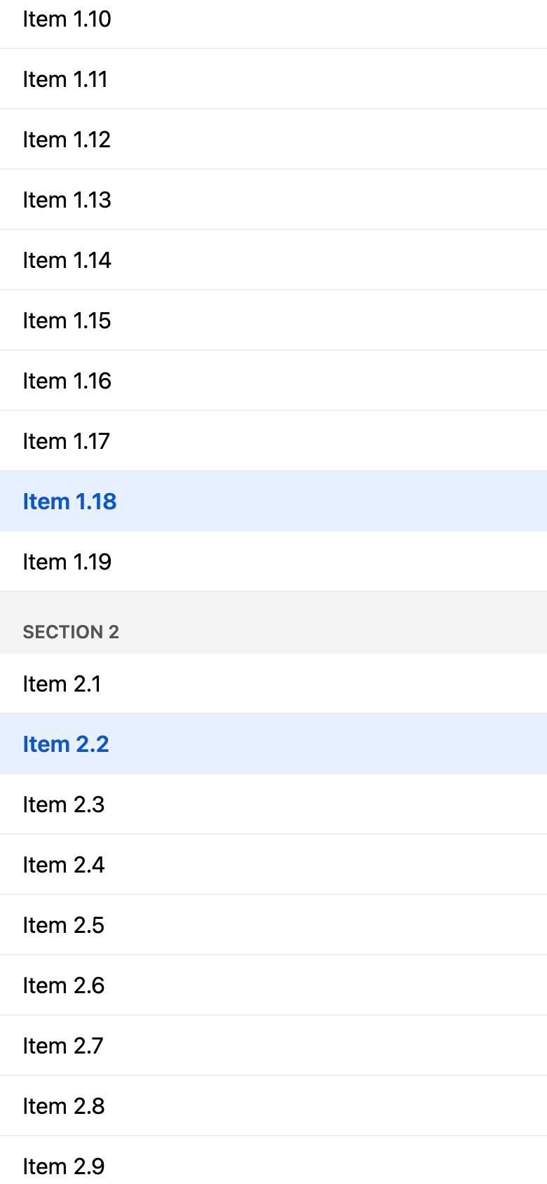
A row is a Pressable with accessibilityRole="button" and accessibilityState={{ selected }}. A selected row gets a light blue background and bold blue text. Headers get a grey background and uppercase text.
Why the selection lives in Feed
FlashList keeps only the items near the visible part of the list mounted. When a row scrolls out of view, FlashList reuses its component for another item, with new props. State kept inside a row therefore belongs to the component, not to the item: the last test below shows a selection moving to another item this way.
So Feed keeps the selected ids in a Set in its state, and each row gets selected as a prop, from selected.has(item.id). Whichever component renders an item, the item's selection comes from its id.
toggle never changes the Set in place: it copies it, adds or removes the id, and sets the copy. renderItem reads selected, which is not part of data, so Feed also passes it as extraData. Each change makes extraData a new Set, and the list renders its rows again.
Using the component
import { StatusBar } from 'expo-status-bar';
import { StyleSheet } from 'react-native';
import { SafeAreaProvider, SafeAreaView } from 'react-native-safe-area-context';

import { feed } from './src/data';
import { Feed } from './src/Feed';

export default function App() {
  return (
    <SafeAreaProvider>
      <SafeAreaView style={styles.container}>
        <Feed items={feed} />
        <StatusBar style="auto" />
      </SafeAreaView>
    </SafeAreaProvider>
  );
}

const styles = StyleSheet.create({
  container: { flex: 1, backgroundColor: '#fff' },
});
App.tsx renders Feed with the generated items.
The test
import { FlashList } from '@shopify/flash-list';
import { render, screen, userEvent } from '@testing-library/react-native';
import { useState } from 'react';
import { Pressable, Text } from 'react-native';

import { feed, type FeedItem } from '../src/data';
import { Feed } from '../src/Feed';

// FlashList schedules work for the next frame after it renders. With fake
// timers, that work runs only when userEvent advances the clock, inside act().
jest.useFakeTimers();

test('shows the first header and its rows', async () => {
  await render(<Feed items={feed} />);

  expect(screen.getByRole('header', { name: 'Section 1' })).toBeOnTheScreen();
  expect(screen.getByRole('button', { name: 'Item 1.1' })).toBeOnTheScreen();
  expect(screen.getByRole('button', { name: 'Item 1.2' })).toBeOnTheScreen();
});

test('pressing a row selects it', async () => {
  const user = userEvent.setup();
  await render(<Feed items={feed} />);
  const row = screen.getByRole('button', { name: 'Item 1.1' });

  expect(row).not.toBeSelected();
  await user.press(row);

  expect(screen.getByRole('button', { name: 'Item 1.1' })).toBeSelected();
});

test('pressing a selected row unselects it', async () => {
  const user = userEvent.setup();
  await render(<Feed items={feed} />);

  await user.press(screen.getByRole('button', { name: 'Item 1.1' }));
  await user.press(screen.getByRole('button', { name: 'Item 1.1' }));

  expect(screen.getByRole('button', { name: 'Item 1.1' })).not.toBeSelected();
});

test('selecting one row does not select another', async () => {
  const user = userEvent.setup();
  await render(<Feed items={feed} />);

  await user.press(screen.getByRole('button', { name: 'Item 1.1' }));
  expect(screen.getAllByRole('button', { selected: true })).toHaveLength(1);

  // Scroll far enough down that FlashList reuses the first rows for others.
  await user.scrollTo(screen.getByTestId('feed'), { y: 5000 });
  expect(screen.queryByText('Item 1.1')).not.toBeOnTheScreen();
  expect(screen.queryAllByRole('button', { selected: true })).toHaveLength(0);

  await user.scrollTo(screen.getByTestId('feed'), { y: 0 });
  expect(screen.getByRole('button', { name: 'Item 1.1' })).toBeSelected();
});

// For comparison only: the same list, but each row keeps its own selection
// in useState instead of getting it from Feed.
function RowWithOwnState({ item }: { item: FeedItem }) {
  const [selected, setSelected] = useState(false);
  return (
    <Pressable
      onPress={() => setSelected(!selected)}
      accessibilityRole="button"
      accessibilityState={{ selected }}
    >
      <Text>{item.title}</Text>
    </Pressable>
  );
}

function FeedWithRowState({ items }: { items: FeedItem[] }) {
  return (
    <FlashList
      testID="feed"
      data={items}
      keyExtractor={(item) => item.id}
      getItemType={(item) => item.kind}
      renderItem={({ item }) =>
        item.kind === 'header' ? (
          <Text accessibilityRole="header">{item.title}</Text>
        ) : (
          <RowWithOwnState item={item} />
        )
      }
    />
  );
}

test("a row's own state follows the reused component, not the item", async () => {
  const user = userEvent.setup();
  await render(<FeedWithRowState items={feed} />);

  await user.press(screen.getByRole('button', { name: 'Item 1.1' }));
  await user.scrollTo(screen.getByTestId('feed'), { y: 5000 });

  // Item 1.1 is gone, but its component now renders another item, which
  // shows as selected although nobody pressed it.
  expect(screen.queryByText('Item 1.1')).not.toBeOnTheScreen();
  expect(screen.getAllByRole('button', { selected: true })).toHaveLength(1);
});
The test runs in Jest, with the jest-expo preset, and uses React Native Testing Library. The example's Jest config, in package.json, also loads FlashList's own setup file, @shopify/flash-list/jestSetup, and adds @shopify/flash-list to transformIgnorePatterns, so Jest compiles the package.
The file turns on Jest's fake timers with jest.useFakeTimers(): FlashList schedules work for the next frame after it renders, and with fake timers that work runs only when userEvent advances the clock, inside act().
The tests find rows by role and name and check the selection with toBeSelected(), which reads accessibilityState. The five tests cover these behaviors:
- the first header and its first rows are shown;
- pressing a row selects it;
- pressing it again unselects it;
- selecting one row does not select another;
- a row's own state follows the reused component, not the item.
The last two tests are about reuse. Each selects "Item 1.1" and scrolls the list, found by its testID, to y: 5000 with user.scrollTo, so "Item 1.1" leaves the screen. With Feed, no row is then selected, and scrolling back to the top shows "Item 1.1" selected again. The last test uses FeedWithRowState, a version of the list defined in the test file, whose rows keep their selection in their own useState. After the scroll, one of its rows is still selected, although it shows another item.
Both screenshots show the web export in a 390 by 844 window.
Verified with Expo SDK 58 (React Native 0.88.1): type-checked, tested with Jest and React Native Testing Library, and exported for web.
Full example: reactnative/examples/flashlist-feed